The Good
When you visit a restaurant or an online store, Google Related does tend to display the most relevant information on the left-most (always visible regardless of screen size) side of the toolbar. For restaurants, the 3 most valuable set of links are the reviews, map, and related places. Google didn’t bother to make sure reviews show up first, but no worries, the second set of related items stay visible until you go smaller than 750 pixels.
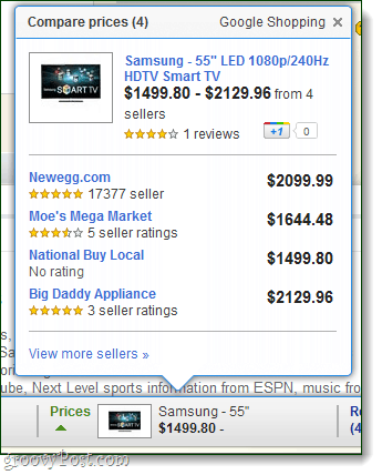
In theory, Google Related makes shopping online a lot more competitive. The price comparison results allow you to instantly see what all the other online stores are charging for the same item. It even includes seller AND product reviews. This is a huge time saver feature and very valuable. The instant price comparison and reviews is very groovy.
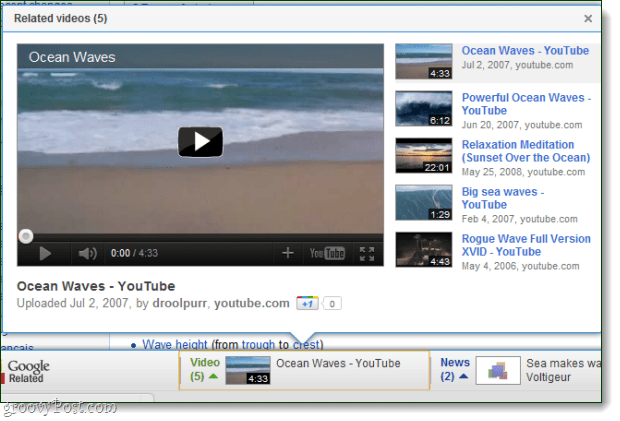
I also noticed a small groovy tidbit. YouTube videos can play directly in the toolbar. It’s pretty cool, though I’m not sure how useful since it’s so small. Still, it hogs up a whopping 650 pixel width when you included the related videos on the side.
The Bad
Often times when you visit a webpage, the Google Related bar won’t even appear. This is more often than not on restaurant and shopping sites. Why? Could be 2 reasons. Either the page is not compatible with the plugin or Google just doesn’t have any good info to share with you on the site. Other times when you use the shopping comparison tool the price isn’t always accurate. Several large eCommerce sites have a shady policy of not revealing the actual item price until it’s added to the shopping cart…. And other times a vendor might change the model number by one digit and therefore the item won’t shop up for Google comparison. These reasons will be a hard nut to crack for Googlers…
The Ugly
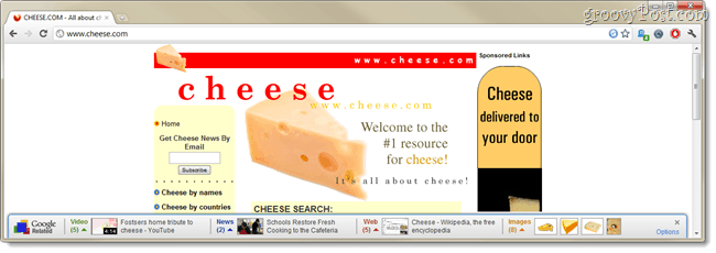
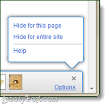
One thing I noticed right away about this bottom-row hogging toolbar, is that it requires an extremely widescreen resolution in order to show all the available options. In the screenshot below, I had to enlarge my browsing window to 1300 pixels wide to make the final related “Images” section show up. If your screen is not wide enough, the extra links such as images or videos won’t be visible and therefore you can’t use them or even know they are there. Although for most of us this isn’t a huge issue however looking over that stats here at groovyPost, there is a HUGE number or people out there surfing the net work 1024×760 resolution. For them, this will hurt. Google owns most of the Web Analytics out there which is probably why it setup the toolbar to display the most valuable sections on the far left – business reviews, mapped address, and price comparison. Regardless of how wide your screen is set to, the Options menu will always appear on the right-hand side. Unfortunately, the options menu doesn’t help out much. I was hoping for some ability to pick and choose which type of related results appear on the toolbar, or heck, even just horizontal scroll support would have been great; neither were included.
Privacy
If you use any Google Toolbar, say goodbye to your privacy. This case stands especially true with the Google Related toolbar, since it automatically queries Google for every single page that you ever visit (unless you are in incognito mode). Google does indeed “make contact” with every page that you visit, regardless of if the toolbar actually appears or not. Google keeps a semi-permanent log of your web history as well per the official Google toolbar privacy notice:
Conclusion
The Google Toolbar is a half-baked extension that doesn’t offer up enough usability in exchange for the huge amount of privacy you give up in exchange. Perhaps in a future update Google will fix things here, but until that happens I wouldn’t recommend it to anyone. Google Related Chrome Extension Download Comment Name * Email *
Δ Save my name and email and send me emails as new comments are made to this post.


