Here, we’ll briefly explain kerning with a couple of examples. Then we’ll show you how to enable and adjust the kerning in Word on Windows and Mac.
What is Kerning?
Kerning refers to the “spacing between characters in a proportional font.” So when using kerning with letters, punctuation, and symbols fit together nicely, you’ll see less space between them. As an example, the upper case letters A and V can benefit from less space between them because of how well they align: AV. For characters that aren’t structured to look well next to each other, more space is provided between them. A good example of this would be the upper case letters T and Y. When those letters are close together, they can sort of run into each other: TY. Kerning will apply a bit of extra space between them. Like many other features, Word offers a way to automatically adjust the kerning for you. Once you enable it, you can simply select the minimum point value. Then, all fonts you use above that value will have kerning automatically applied.
Enable and Adjust Kerning in Word on Windows
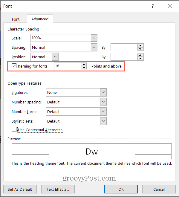
To turn on kerning in Microsoft Word on Windows, open your document and follow these simple steps.
The automatic kerning feature only applies to the document you set it for. So, you’ll need to follow the steps above to enable it for each Word document where you want to use it.
Enable and Adjust Kerning in Word on Mac
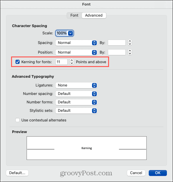
Even though kerning works the same way in Word on Mac, you just have to navigate to the setting a bit differently than on Windows.
Again, the kerning on Mac will apply to the current document that you enable and adjust it for, just like on Windows. You must enable it for each document separately.
Character Spacing
Kerning isn’t meant to be a blatantly obvious adjustment to spacing. It’s subtle and simply makes the appearance more pleasing to the eye. And you may only notice a difference with specific font styles.
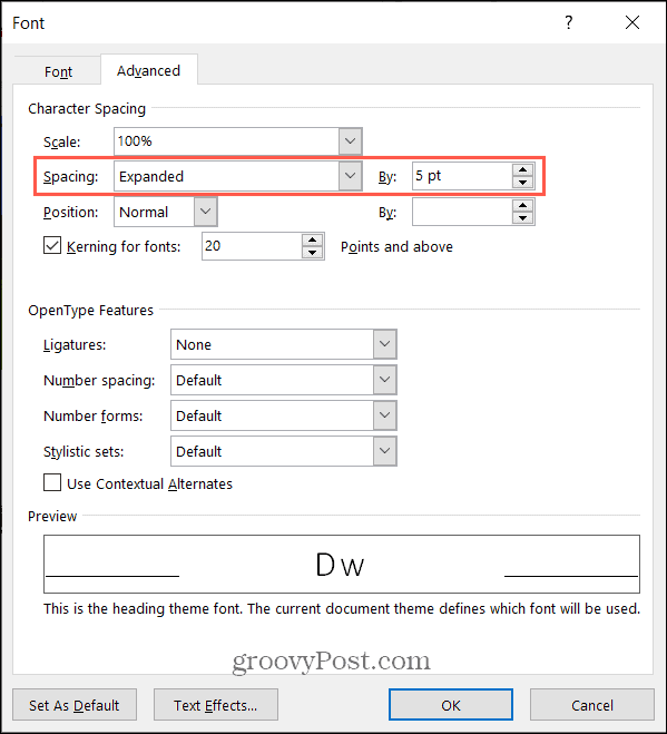
So if the amount of spacing you see with kerning enabled isn’t enough, you can use the Character Spacing feature as well. This allows you to expand or condense the spacing by a set number of points.
You should see an immediate change in the spacing between characters for your selected text. Just keep in mind that character spacing differs from kerning in that it applies to all letters, punctuation, and symbols regardless of how well they fit next to each other.
Will You Be Kerning?
Unless you’re familiar with typography by trade, education, or experience, kerning probably isn’t something you think much about. But if you’re concerned about the appearance of the font in a Word document, this may be just the ticket to a perfectly beautiful, finished product. For other ways to work with fonts in your documents, take a look at how to set the default font in Word and how to change the font of an existing Word document.
![]()


